3CX Web Client new features and changes in v18.
See the redesigned 3CX v18 Web Client vs the v16 Web Client.
Even in its earliest iterations, 3CX was always intended to work just as well without handsets as with. As such the Windows App and, more recently, the Chrome-based Web App have been the focus of development when it comes to system-to-user interactions.
The 3CX Web App has been getting better and better, both in terms of features and reliability, with the COVID crisis proving its robustness as a use-anywhere communication device.
For the latest major release, version 18, 3CX have promised a radical redesign of the Web Client. Have they improved the design? have they made it even easier to use? Or have they ruined it with over-development?
Well, that’s what we’re going to find out in this article (and the accompanying video), so let’s find out together!
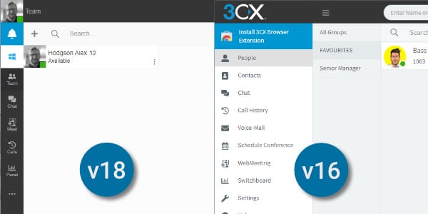
Cleaner and clearer look.
In the image above you can see the outgoing version 16 web client on the left alongside the new 3CX version 18 web client on the right.
What immediately stands out is how much clearer and cleaner v18 looks. It’s also much less colourful, which may be a shame to some, and an improvement to others. That probably depends on your own personal feeling. Overall, though, there’s much less going on visually, and I think that’s a deliberate and welcome move from 3CX.
They’ve essentially made the top ribbon more focused and precise, and made the left menu more compact, allowing for more functional space in the middle, a move I think will be welcomed by busy contact centre users.
So let’s take a look in more detail at that pared-down top menu ribbon.
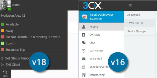
Top bar tidy-up.
When looking at the new top bar, the first thing you notice is that the unnecessarily large 3CX logo has been shrunk and moved out of the way. It’s now in the top right corner, and the user icon has been swapped the other way.
Another part of the top bar tidy-up is that your 3CX status has been moved into the user menu and a useful little colour block added so you can quickly see which status is currently set. Also, now being in the top left corner, it’s where your eye is going to be naturally drawn.
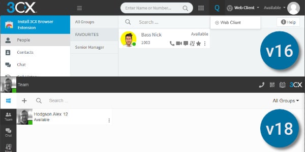
Searching for search.
As you can see from the image above, the central search bar from v16 has disappeared. In reality, this simply duplicated search functions found elsewhere, so it’s no surprise it was deemed surplus to requirements.
The device toggle, which allows you to select which device to receive and make calls on, which was found on the top bar in v16, has been moved into the dial pad for v18. You could say this is perhaps a little more inconvenient, but it’s not the kind of menu option that users will change regularly in a day, so it shouldn’t slow users too much.
The dial pad itself is now a neat pop-out accessed by clicking the phone icon in the top right corner.
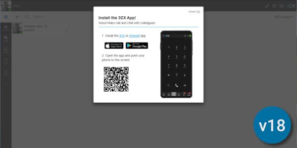
Easier provisioning.
A good addition for v18 is that the QR code, used to set up your other 3CX devices, has been made more accessible. This was previously buried in the user menu. This will make provisioning of new devices much simpler.
Also a benefit for initial setup is the User Guide moving to a more visible position so it can be referred to more easily while new users get used to the system.
In v18 the additional Chrome plugin is no longer required, so that space has been cleared up and replaced simpler and less obtrusive prompt to download the Windows app instead. With v18 3CX also now enables direct integration with Microsoft Teams for calling, so perhaps this is why the Windows app is being emphasised here.
A few name changes.
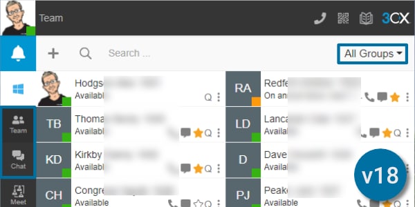
A few of the sections of the left-hand menu have had minor name changes to go with a few small layout changes.
As you can see, the People section has now become Team and the Groups sub-menu has been moved over to the right-hand side, freeing up an entire column of new space. The Contacts section has been moved much further down, inside the “…” menu.
Chat is still Chat, but again the sub-menu items have been moved over to the right to create space. This space has then been used to make scrolling between chats easier, rather than having to open a new screen as in v16.
The slightly confusing “new chat” icons from v16 have also thankfully been replaced, and the button moved to a more convenient location.
Call History is now just called Calls and is plainer and less colourful, but I think clearer and easier to understand, and again, the sub-menu moved to a toggle to create space.
Voicemail is pretty much the same, but has been moved to a sub-menu. I don’t mind this as most people use voicemail to email, meaning the voicemail screen itself isn’t used as much.
WebMeeting consolidation.
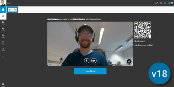
Another menu consolidation is that Schedule Conference and WebMeeting have been moved into a single screen called Meet. This is a much tidier approach than in the v16 Web Client. When you click into Meet you’ll be greeted by the Join Now button for an instant conference. The plus gives you the option to schedule your conference, and the next option is where your scheduled conferences will be.
Switchboard has been renamed Panel, for a reason that’s not entirely clear, but once again the sub-menu moves over to the right to create more usable space.
Settings menu changes.
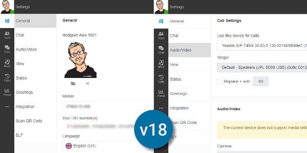
Moving away from the main menu elements and into the elipsis (…) menu, this contains Contacts, Voicemail and Settings.
The changes in Contacts and Voicemail largely follow the changes seen above, but the Settings menu has had a few additions.
The password reset and user icon options have been moved into General settings from the User drop down menu.
Thankfully for a system built to unify your business communications, the Chat and Audio/Video settings are now easier to access instead of being hidden in sub-menus.
In fact, the Personalise menu has effectively been done away with and its contents moved onto the main bar.
Status View is now simply “View” and the Active Calls section has been moved in here. Status is now the new and more logical name for Call Forwarding, and BLF setting is now just BLF (Busy Lamp Field).
And finally, instead of rooting around in your User menu to see what Apps are available to you, an easy way to find Apps menu has been added to the bottom
Tider and easier to use.
So overall, a few functional changes, but mainly just a much tidier, more efficient and easier to use Web Client for 3cx version 18. Personally, even though we’ve lost some of the colour, I like these changes, and I can see it being much more user friendly for people who use it for the bulk of their working day, such as Contact Centre workers.
But what do you think? Are there elements you’d prefer to keep, or wish had disappeared? Or extra features you wish were there but aren’t. Let us know in the comments.
More about 3CX v18.
We’ve got a number of videos about 3CX v18 on our YouTube Channel, so don’t forget to Subscribe for more 3CX content.
Use 3CX in your business
3CX powers businesses of all shapes and sizes, and One2Call supports those businesses.
From full-service managed service to setup and handover, as 3CX Gold Partners and communications specialists, we’re the ones to call to get the power of 3CX working for your business.
Speak to one of our 3CX consultants:
Contact Us
Testimonials
Danielle, Tremark Associates Ltd
Jordan dealt with both my issues quickly and were both sorted within the hour.
Pauline, Khepera Business Park
Tenant is very satisfied. They were impressed by Adam’s knowledge and helpfulness.
Sam P, 50Five
Very nice chap sorted out the problem for me. Nothing else I could ask for.


